
 |
| 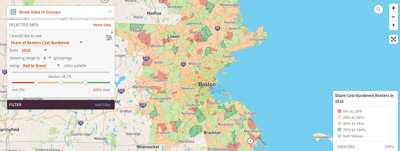
The Harvard Joint Center for Housing Studies’ interactive Neighborhood Change Mapping Tool lets anyone see how their neighborhood has or hasn’t gentrified, and has tools to let users create their own maps. Image courtesy of Joint Center for Housing Studies and Google Maps
The cities, towns and neighborhoods that together make up greater Boston have changed significantly in the last few decades. But those changes have not been uniform across the region.
The changes and the differing patterns of change are illustrated in a new Boston Neighborhood Change Mapping Tool and a related policy brief, Mapping Over Two Decades of Neighborhood Change in the Boston Metropolitan Area, bavailable at jchs.harvard.edu. Both were produced by Harvard’s Joint Center for Housing Studies with partial support from The Boston Foundation.
The interactive tool, which includes both preloaded maps and tools that allow users to create their own maps, shows that home prices and rents are high and have risen significantly in most tracts across the Boston metro area. This region includes the urban core and stretches north to parts of southern New Hampshire, west to some of central Massachusetts, and south towards, but not into, Cape Cod and Massachusetts’ South Coast cities.
)Incomes Rising Slower than Rents
Between 1990 and 2016 the inflation-adjusted median home value in the Boston metro area rose by 26 percent, from $291,200 to $368,300. However, during that time, the real median home value fell in 12 percent of the region’s census tracts, most of them located either in southern New Hampshire or in some older Massachusetts cities. In contrast, real home values grew the most in Boston, Cambridge and Somerville; and in many affluent suburban communities to the west of Boston; and some communities on the North and South Shores.
Real median rents rose by 11 percent between 1990 and 2016, increasing from $1,100 to $1,300. They increased in 73 percent of the region’s census tracts with the largest increases occurring in South Boston, Charlestown, Jamaica Plain, East Cambridge and Brookline. Many of the tracts where real median rents dropped were in the region’s outlying areas.
Because incomes did not rise as fast as rents, the share of renter households considered cost-burdened (because they paid 30 percent or more of their income for housing) rose from 39 percent in 1990 (and 37 percent in 2000) to 47 percent in 2016. Additionally, the share of tracts where the renter cost burden rate exceeded 50 percent skyrocketed from 15 percent of all tracts in 1990 to 46 percent in 2016. The growth in these tracts occurred throughout the region, particularly along the North Shore from Chelsea to Gloucester and in southeastern Massachusetts from Brockton to Plymouth and beyond.
Customized Definitions of Gentrification
The different trajectories for house prices, rents and incomes highlight the fact that while some of the region’s poor neighborhoods have gentrified since 1990 others are still marked by concentrated poverty.

David Luberoff
Using one standard measure – which defines neighborhoods as “gentrified” if median household incomes in 1990 were below the metro-wide median, if median house prices or rents grew by more than the metro-wide medians between 1990 and 2016 and if the share of residents who were college-educated also grew by more than the metro-wide median percentage point increase – the research brief finds that 167 of 485 low-income tracts in 1990 had gentrified by 2016. Not surprisingly, many of these tracts are in South Boston, East Boston, Charlestown, parts of Dorchester, Roxbury, Mission Hill, Jamaica Plain, Cambridge and Somerville. In addition, tracts in several outlying areas including Gloucester, Malden, Quincy and Waltham also gentrified in this time. In contrast, the 318 non-gentrified tracts are mainly located Dorchester, Mattapan, and Hyde Park as well as in much of Brockton, Chelsea, Lawrence, Lowell, Lynn, Revere and Rochester, New Hampshire. Parts of Framingham and Marlborough remained non-gentrified, as well.
Because these results are the result of using one of several definitions of gentrification, the mapping tool gives users the ability to set their own measures and see if – and how – different measures produce different results.
David Luberoff is deputy director of Harvard’s Joint Center for Housing Studies and is co-author, with Alexander Hermann and Daniel McCue, of Mapping Over Two Decades of Neighborhood Change in the Boston Metropolitan Area.